Client Case Study
Six months after rewriting and redesigning The Springs’ website…
Total bookings up 10%
New visitor bookings up ~60%
Team meeting space bookings up 30%
Monthly donations up 20%
Office admin time reduced by 50%
The Springs is an overnight retreat center for pastors and church leaders.
They offer four overnight cabins, a day retreat space, and a large team meeting space.
As a nonprofit, all rentals are donation-based.
The Springs’ website had several problems:
Guests had to email requests to see what cabins and dates were available (no ability to book online)
Didn’t communicate a clear problem that The Springs helps solve
Didn’t tell a compelling story that people would want to join
Outdated and didn’t appeal to a younger audience
Centered The Springs (not the guest) as the hero
Few photos of the beautiful spaces they offer
Donating was difficult and confusing
Cluttered with too many words
No clear call to action
Unprofessional logo
Before
After
*Live site may differ in appearance from what is presented due to changes made by the website owner since project delivery.
How we rebranded The Springs website in just a few weeks.
We followed my simple, enjoyable writing and design process and solved every problem with The Springs’ website.
+ Start
Leif and I connected on a brief call and discussed his goals and vision for his website. We were a good match to work together, so we moved to the next step.
+ Foundation
We then laid a strong foundation by writing a clear message for The Springs website. We ensured that we captured the story and history of the retreat grounds.
+ Buildout
Over the next few weeks, I built out the website. I also found, built out, and integrated a third-party booking platform to automate their booking process. We also made donating a breeze.
“Andy did an incredible job developing our website with clarity and vision.
He captured our story and provided a ‘Wow’ factor that I did not anticipate.
We continue to get rave reviews from our guests and friends about our new website!”
Leif Anderson
Co-Executive Director, The Springs
The results speak for themselves.
Total bookings up 10%.
New visitor bookings up ~60%.
Team meeting space bookings up 30%.
Monthly donations up 20%.
Office admin time saved: 50%.
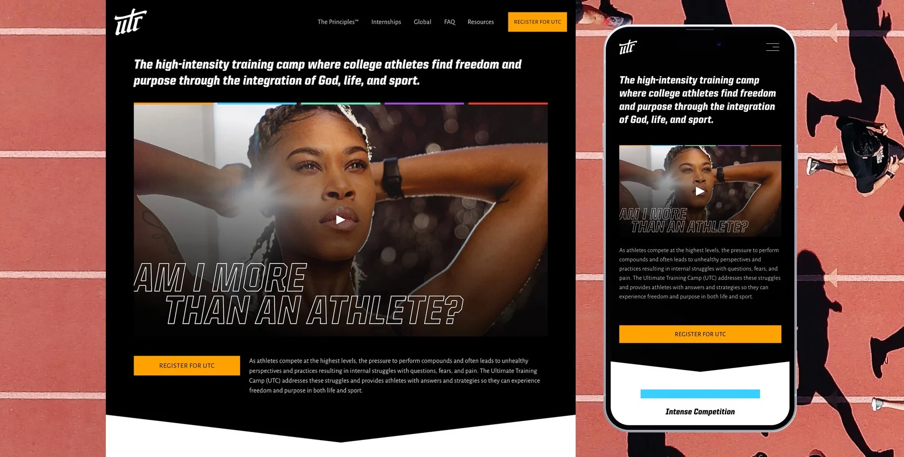
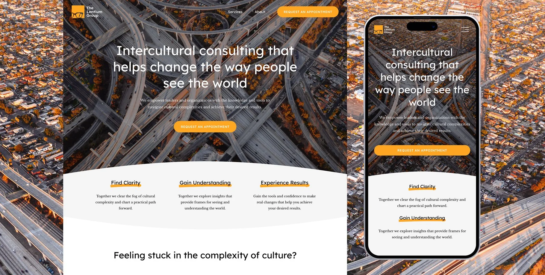
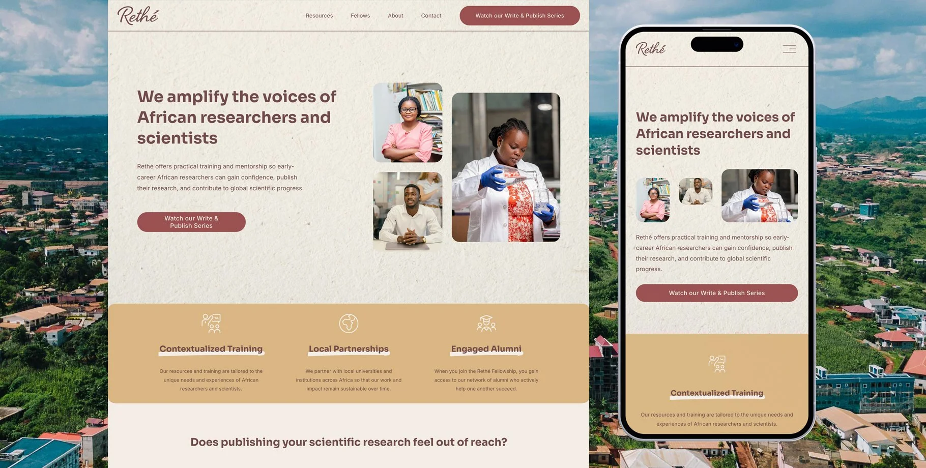
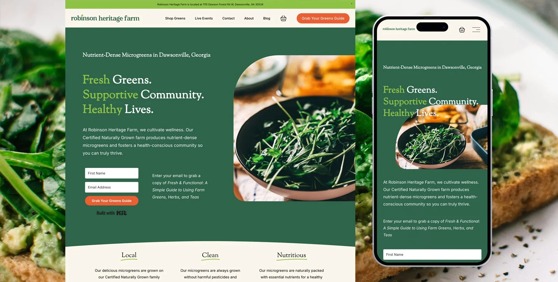
Other clients are also experiencing success.
It shouldn’t take months of headaches to upgrade your website.
+ Starting a new business?
Launch your first website in a week, attract the right audience, and nail first impressions.
+ Launching a new service?
Make sure your website is updated to match the excellence of your new service offering.
+ Making a strategic pivot?
Make your shift with confidence, knowing your website and message are clear and compelling.
You’re a professional. Your website should be too.
Not sure what to write on your website homepage?
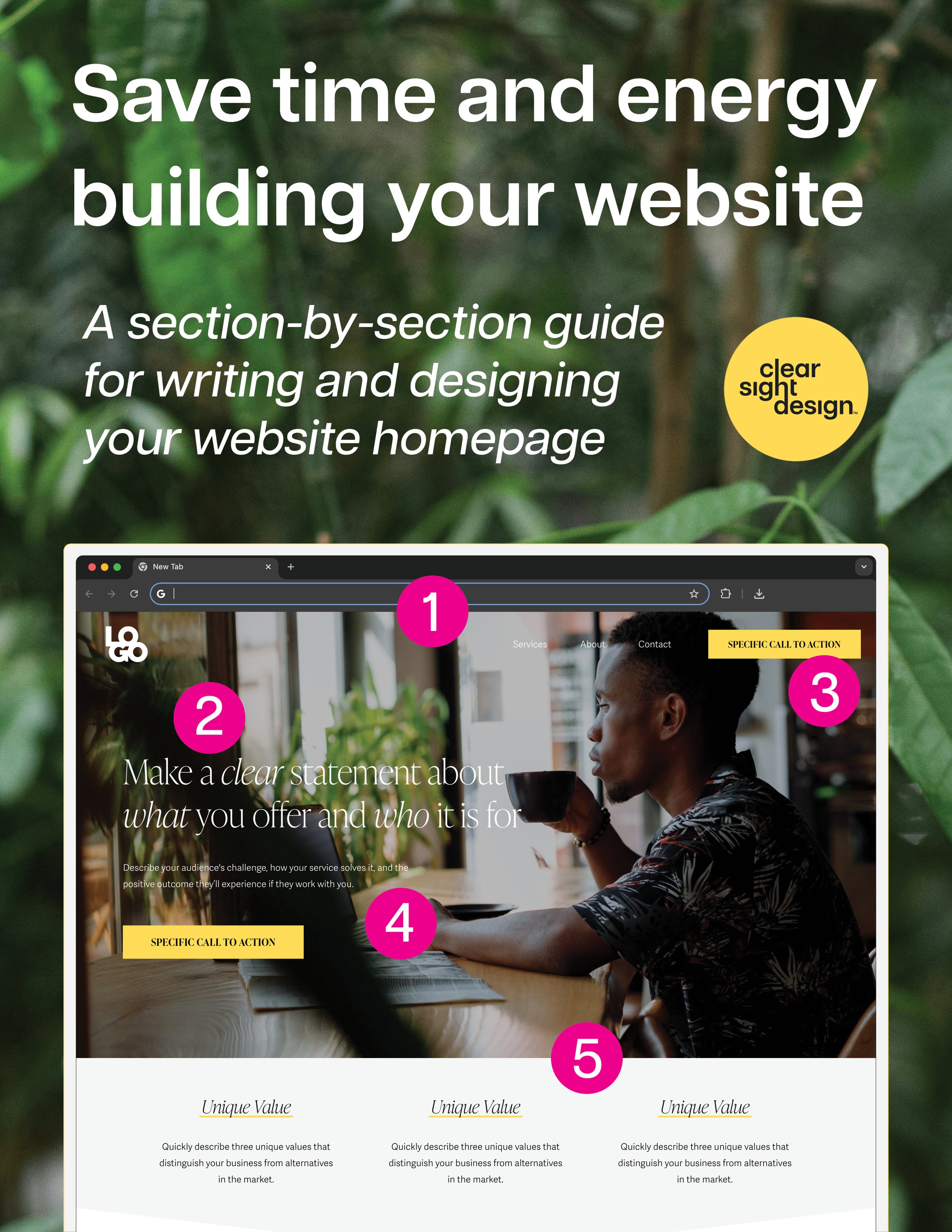
This free guide will save you time, energy, and frustration by showing you what to write and how to design each section of your website homepage.


