
Tuesday, October 13th • 6:00-7:15 PM • 5/3 Bank Tucker
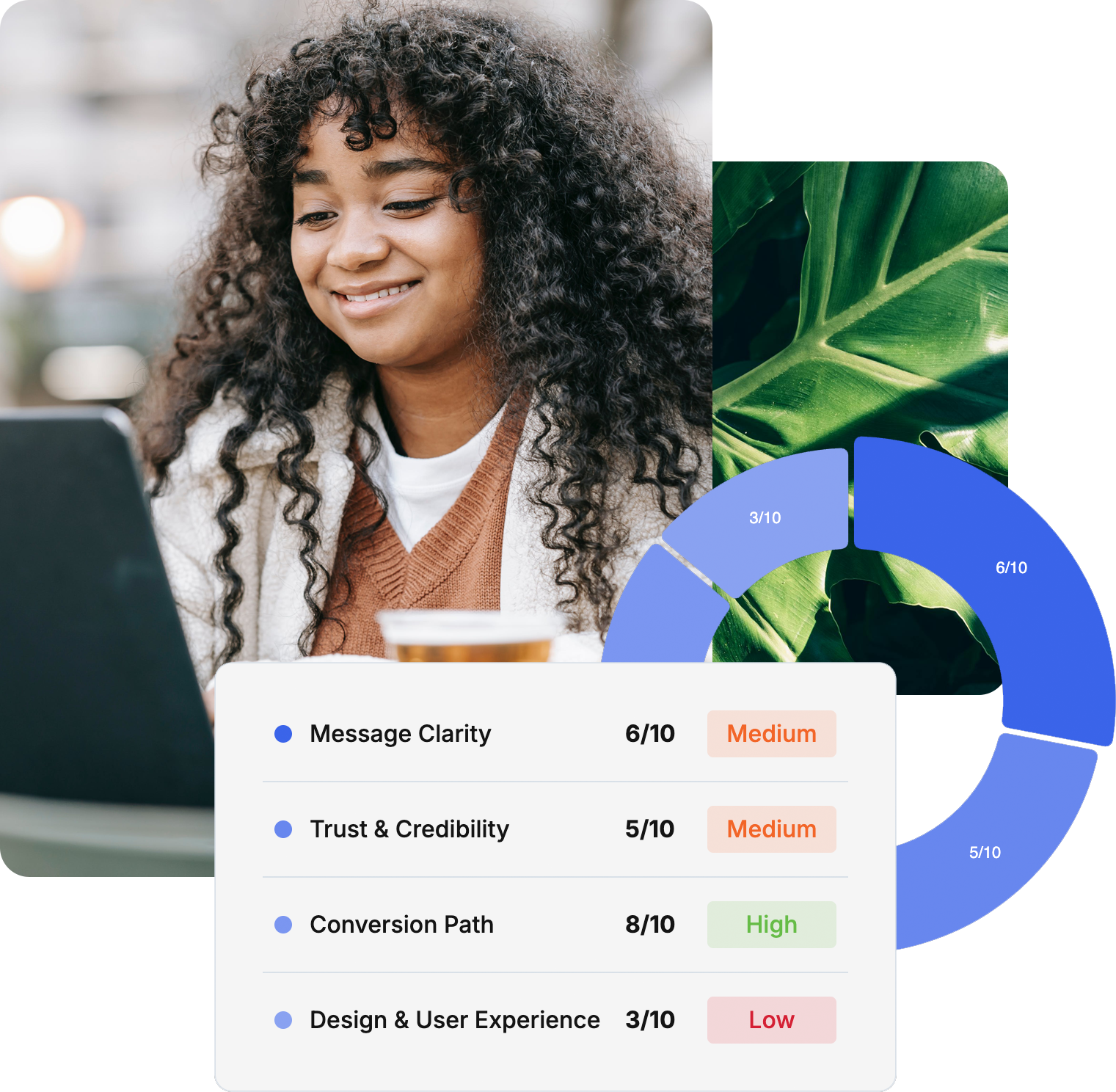
Is your website hurting your credibility?

Learn the top website mistakes that hurt website credibility
Learn how storytelling increases website engagement
Get live feedback & tips for your website

With Andy Rhodenbaugh
Founder of Clear Sight Design
StoryBrand Certified Web Designer


Websites that grow credibility & confidence
+ MY WHY
Excellent people
doing excellent work
should look & sound
as excellent as they are.
+ STANFORD RESEARCH
The top two factors when evaluating a website’s credibility:
+ TOP TWO FACTORS
Design & Words

+ THE PROBLEM
Most websites undermine credibility by making five critical mistakes.
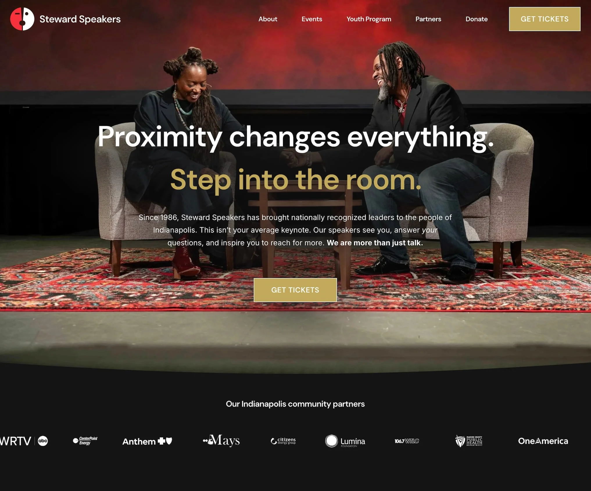
Mistake 1: Outdated design
This 40-year-old organization wasn’t showcasing the excellence they deliver.
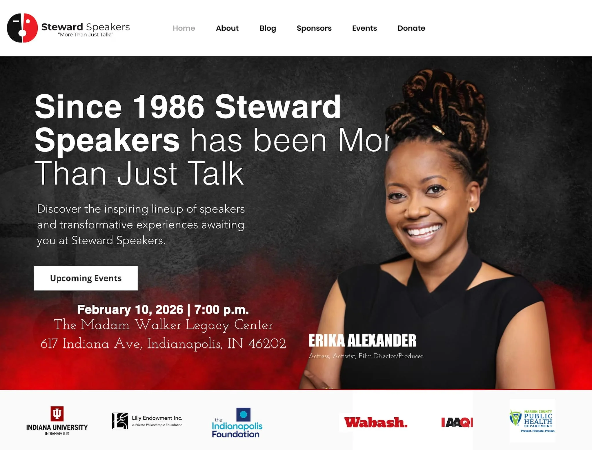
Solution: Strategic design
Updated branding and layout to draw the visitor in.
Listen for what Katie, a credentialed business coach said:
“My outdated website is my excuse for not putting myself out there.”
Mistake 2: Clutter
This client had 10 buttons to choose from and unorganized photos and text.
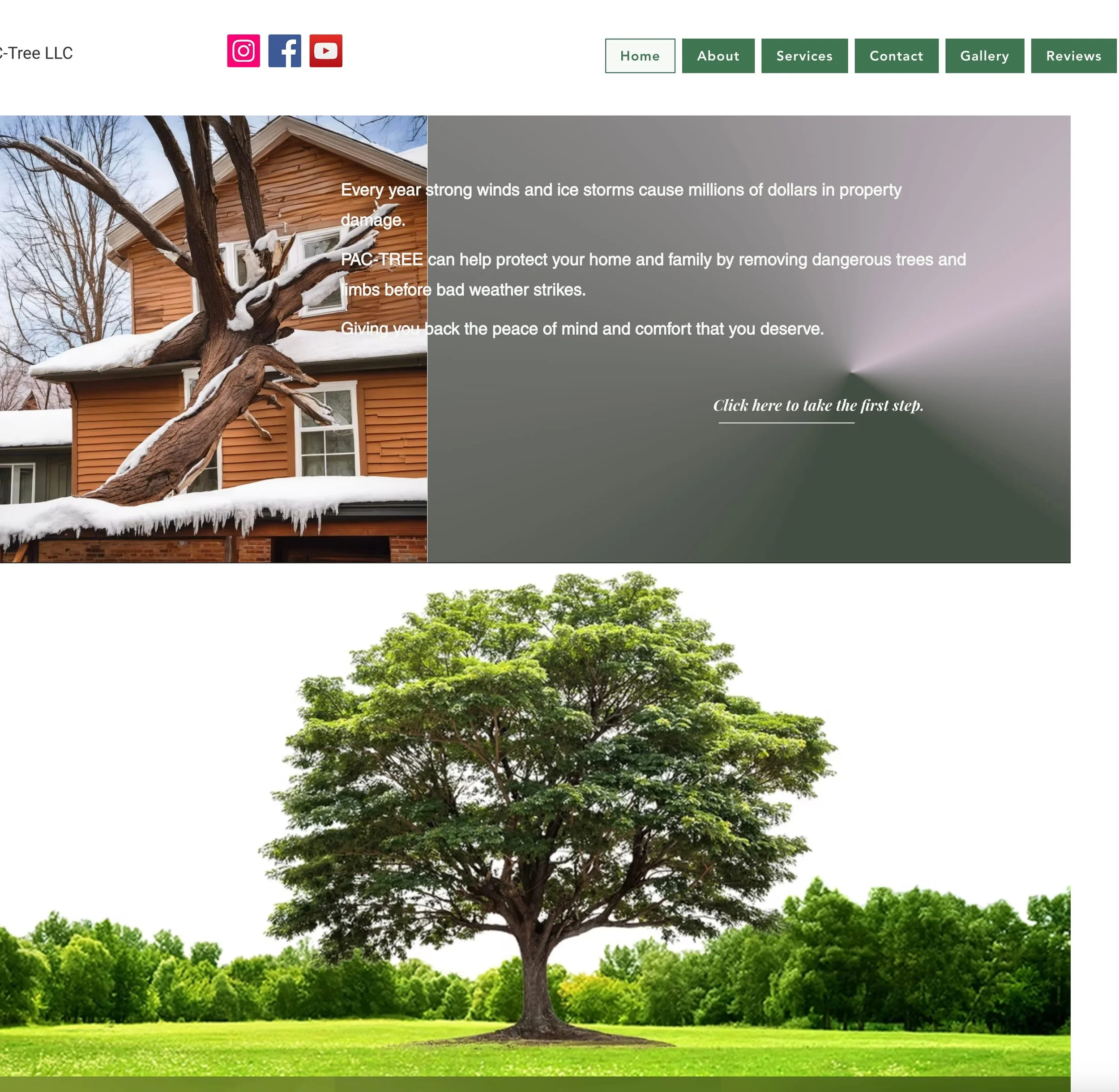
Solution: Give the website one job
We cut 6 buttons, updated the messaging, and made one clear CTA.
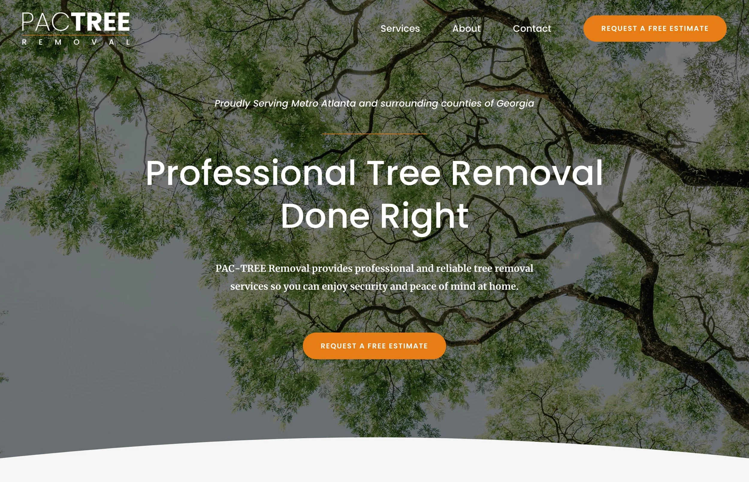
Listen for what Kayla Sullivan told me the first time I met her:
“I’m not giving you my business card because I don’t want you to see how bad my website is.”
Mistake 3: Getting the hero wrong
We cut 6 buttons, updated the messaging, and made one clear CTA.
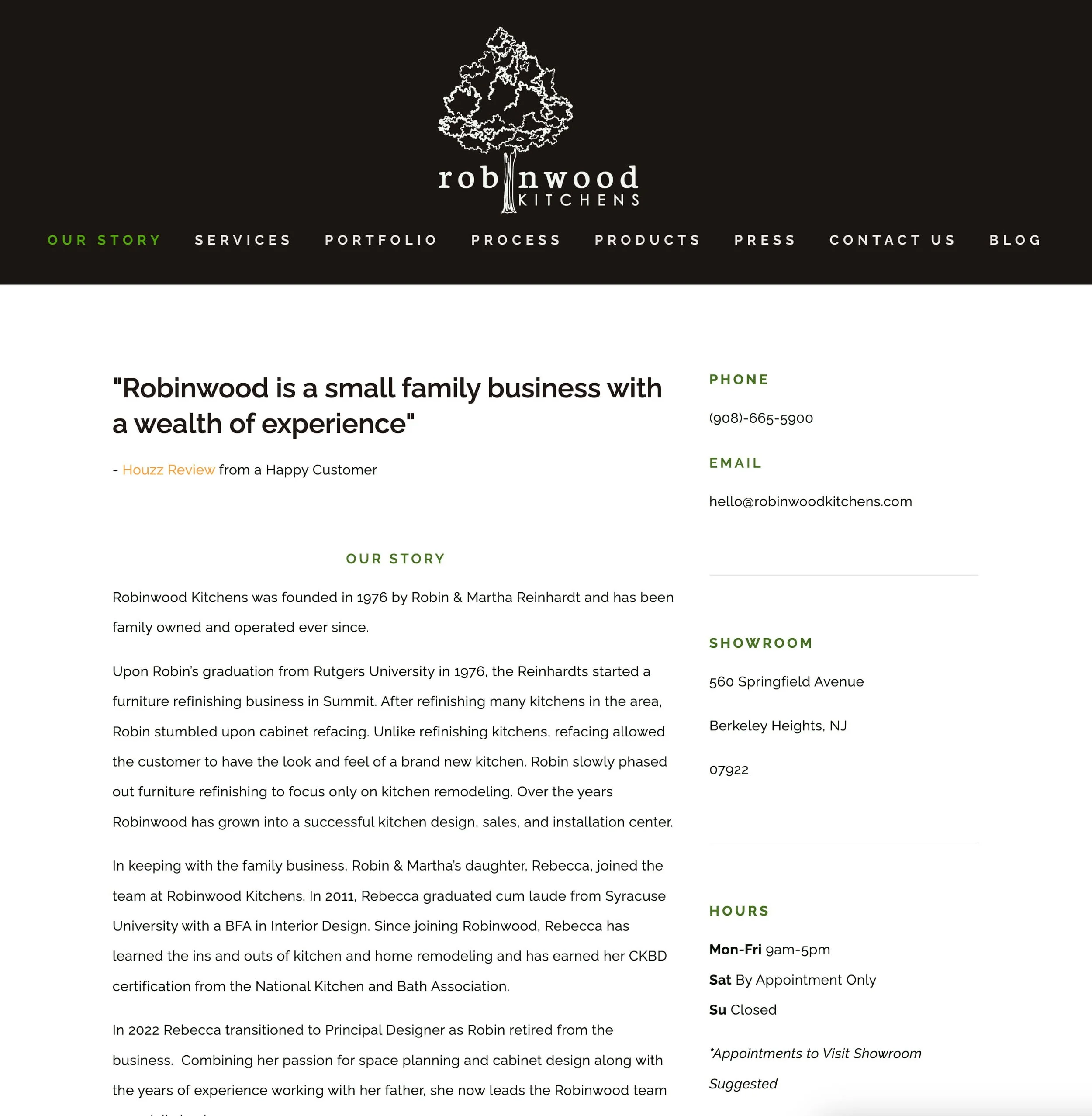
Solution: The customer is the hero

Listen for what Konrad, a painting business owner said:
“Our website is bland and uninviting, and doesn’t show our ideal client that we know their story.
It feels like running into a brick wall when we share our website, if we even try to share it at all.”
Mistake 4: Confusing messaging

Solution: Zero Cognitive Load messaging

Listen for what Gaelin, an experienced public speaker said:
“I need help clarifying my message so I can level up my business.
Sometimes those closest to the problem have the hardest time communicating to others why it matters.”
Mistake 5: No clear call-to-action
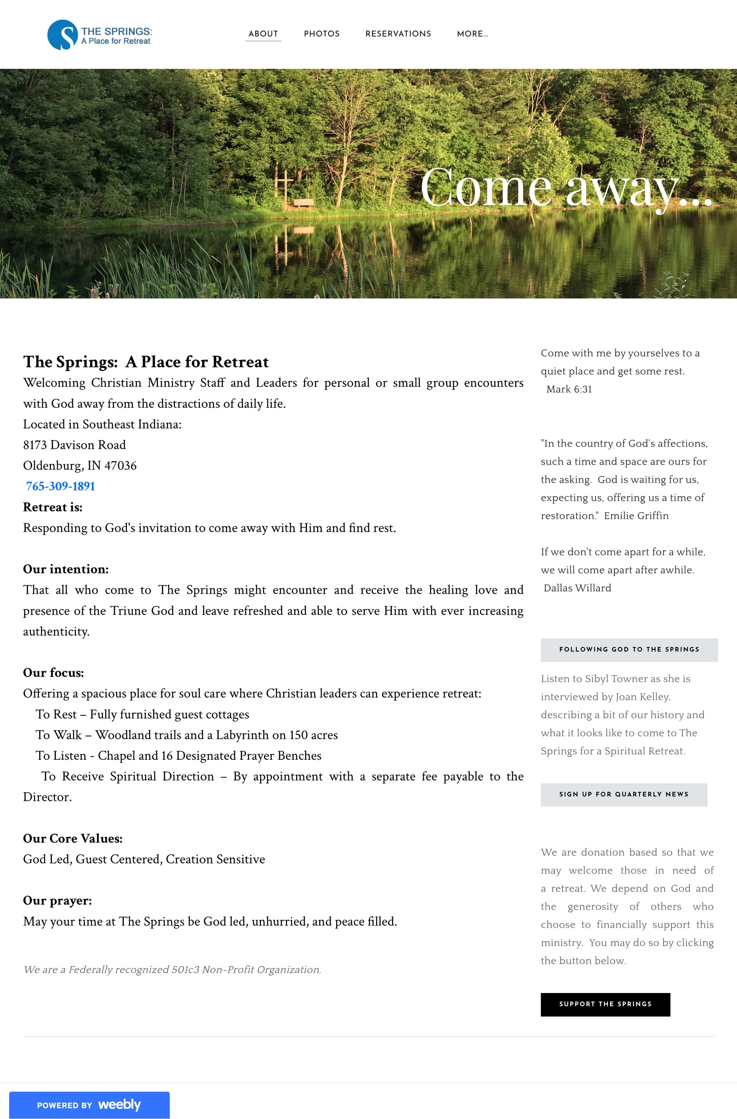
Solution: Clear call-to-action
Within 6 months, donations went up 20%, and first-time bookings went up 60%.
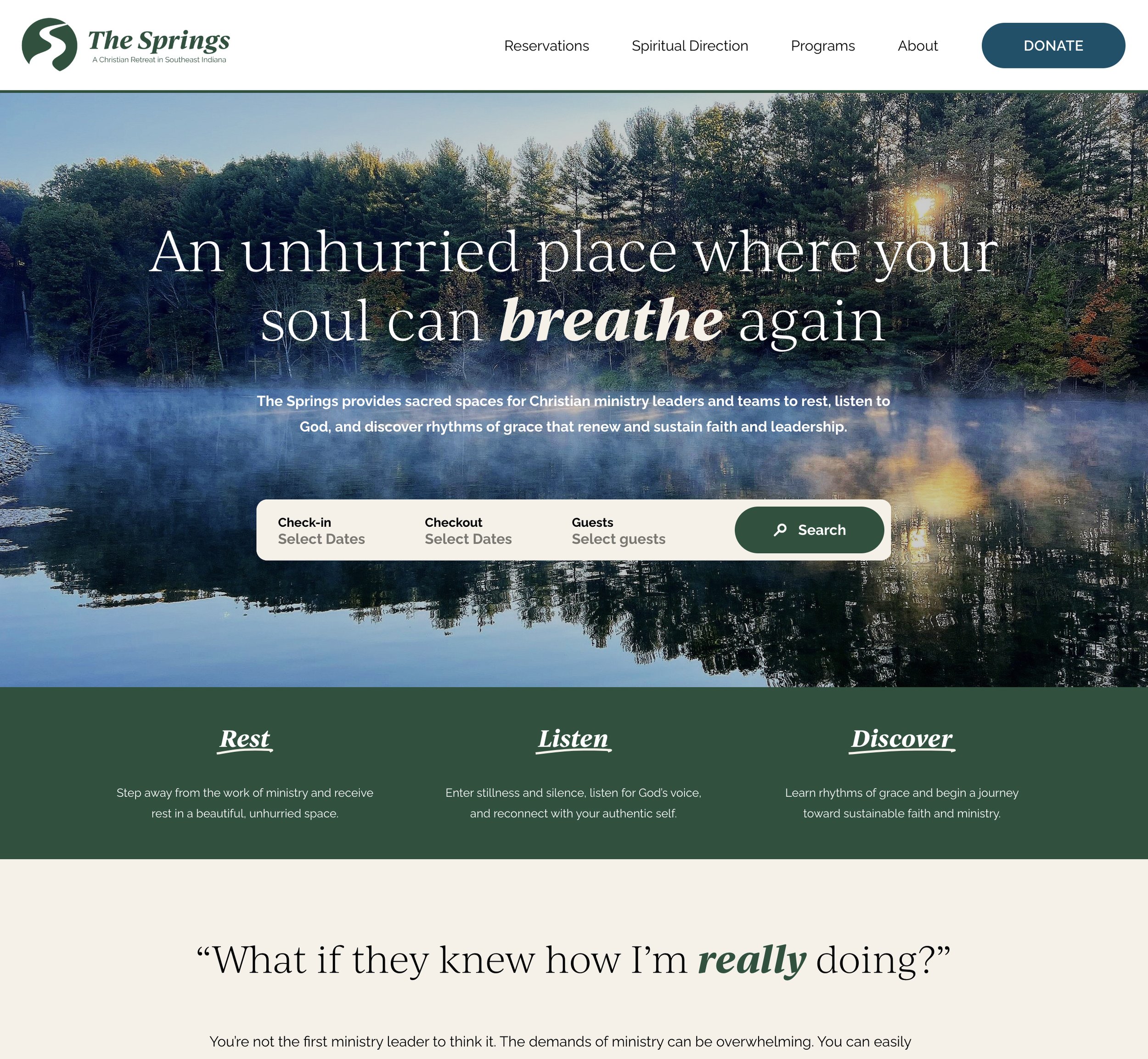
Listen for what Dave, an international nonprofit director said:
“Our website is functional but not very compelling or easy to navigate.”
“The customer is the hero of the story, not your brand. When we position our customer as the hero and ourselves as the guide, we will be recognized as a trusted resource to help them overcome their challenges.”
– Donald Miller, Building a StoryBrand


1
StoryBrand Certified
No winging it.
I follow a proven messaging and design framework that works. StoryBrand has helped over 100,000 organizations, and I have the training and license to use it.
2
1:1 Attention
No ghosting.
I perform four roles for the client: project manager, copywriter, designer, and developer.
We schedule every meeting ahead of time so clients know when their website will launch.
3
Speed
No months of headaches.
Most projects take 3 days to complete and require only 4 hours of client time.
I also have a 1-day website option and longer projects with more customizations and integrations.
Score your website.

+ Three main problems I see on small business websites
1 Complex, cluttered layout
(“I’m not a circus, so I shouldn’t look like one.”)
2 Unclear story & too many options
(The client often doesn’t know what they need, so they get confused.)
3 No clear call to action
(Google: 70% of small business websites don’t have an actionable CTA)