Farm Website Template
Resource Library for coaching clients of Charlotte Smith
Congratulations on your new website template!
Charlotte Smith has partnered with Andy Rhodenbaugh, owner of Clear Sight Design, to bring you a custom Squarespace website template designed specifically for Charlotte’s farm clients and students. This page is your resource hub. Here you’ll find a curated collection of resources, guides, and tutorials to help you customize your template and launch your website. Here’s what you’ll find on this page:
Tutorial videos showing you how to customize the template and launch your new website
Squarespace Customer Support links
Homepage copywriting tips
Search Engine Optimization (SEO) Support
Royalty-free stock photos & sourcing suggestions
Business growth courses & resources
Don’t want to DIY your template? Hire Andy Rhodenbaugh, your template designer, to do it for you…
Getting started
Step 1
Watch this video to set up your Squarespace Website Account.
Step 2
When you are ready to start customizing your website template, email Charlotte and share the email address associated with your Squarespace account. Her team will deliver your template to your Squarespace Dashboard.
Step 3
Follow the video tutorials below to customize and launch your website.
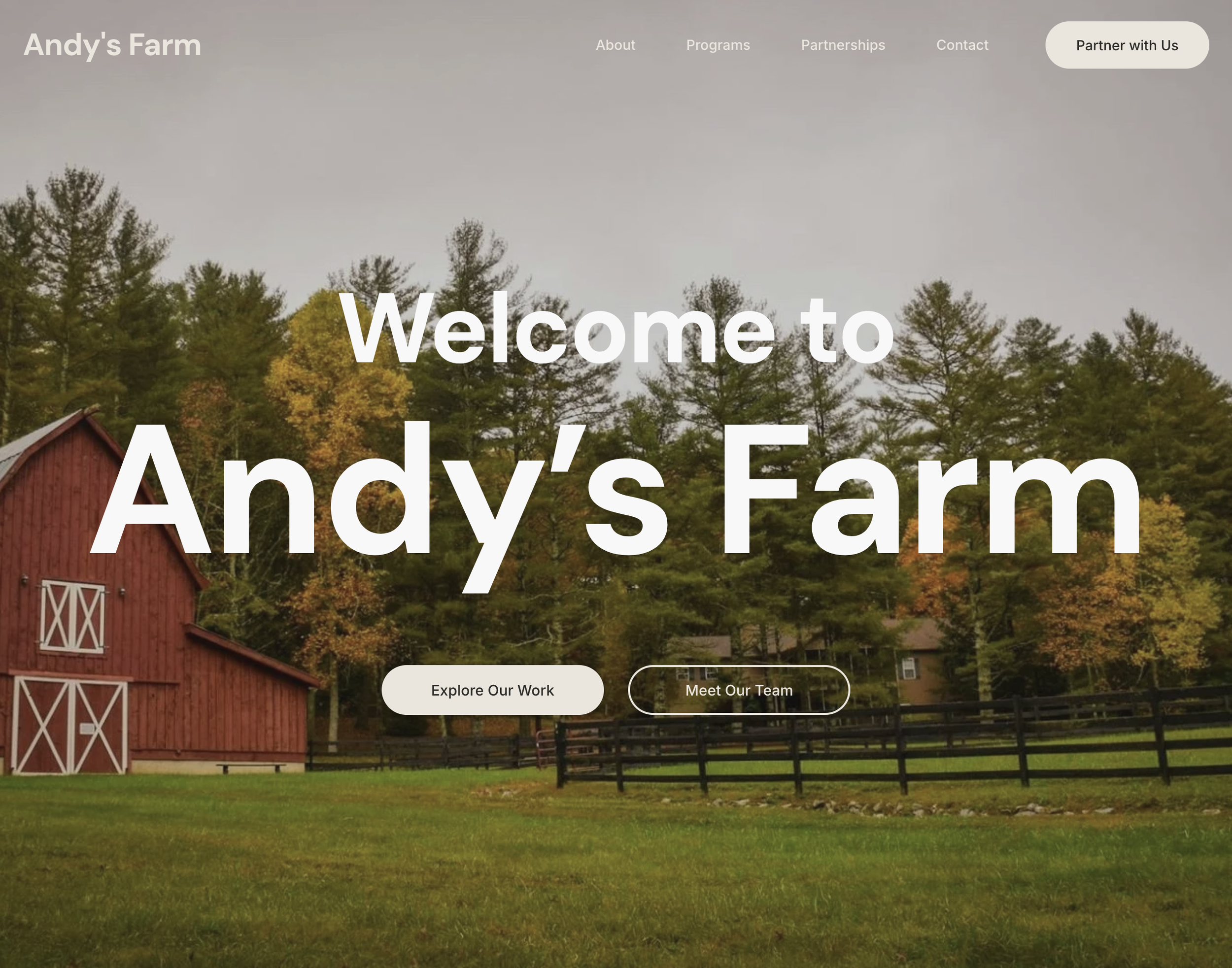
As you customize your template, visit the website of “Charlotte’s Farm” for a model of how Charlotte intends your completed website to look.

1. Video Tutorial Library
Your template designer, Andy Rhodenbaugh, has filmed this set of tutorial videos to help you customize your template and launch your new website. Watch the videos (and make your edits) in sequential order for the fastest launch.
Welcome
If you already have a Squarespace website, start here first.
Some farmers already have a Squarespace website for their farm. If this is you, great!
You can still take advantage of Charlotte’s template by integrating it into your existing Squarespace website.
This way you get the benefits of Charlotte’s methods while maintaining your domain, website pages, and SEO.
Watch this video (with Andy’s Farm) for instructions on how to integrate each section of Charlotte’s template into your existing website.
For farmers who don’t have a website or are moving to Squarespace for the first time, please start below.
Welcome to Your New Website
Squarespace Customer Support
Extend Your Free Trial
Orientation
1. Setting up your Squarespace Account
2. Receiving Your Template from Charlotte
3. Orientation to Squarespace Settings
4. Orientation to Left Sidebar
5. Orientation to Right Sidebar (Site Styles)
6. Orientation to Desktop/Mobile/Preview
Customize
7. Overview of Editor
8. Edit Color Palette
9. Edit Logo & Photos
10. Edit Navigation Links & Text
11. Edit Footer & Section Colors
12. Adding Social Media Links
13. Add Favicon & Social Sharing Image
14. Edit Blog Pages
15. Edit Store Pages
16. Edit Store Checkout Page
17. Overview of Store Backend
18. Search Engine Optimization (SEO)
Lead Magnet
19. Set Up a Kit Account
20. Create a Kit Form & Welcome Email
21. Embed the Kit Form on Your Website
22. Website Lead Magnet Section (Shortcut)
23. Website Promo Pop-Up & Banner
Launch
24. Connect or Transfer Your Domain
25. Purchase Subscription & Launch
After launching your website, you can schedule a complimentary 15-minute call with Andy, your template designer, to fine-tune your website layout.

2. Squarespace Customer Support
Your website template is built on the powerful Squarespace website-building platform. Once you activate your Squarespace subscription, you’ll have access to Squarespace’s award-winning Customer Support team. Contact Squarespace for help with your website.

3. Homepage Copywriting Tips
Your website template has copywriting prompts written directly into it. These copywriting prompts provide Charlotte’s suggestions for what to write in each section of your website. Below, we have each section of the website template with numbered pink dots with corresponding notes and ideas for you to consider as you customize and write your website content. The goal of this brief guide is to save you time, energy, and frustration. By following the layout and prompts below, you will be better positioned to connect your products and services to the clients that need them most.
Section 1: Hero
This most important section on your site is all about your customer. You have about three seconds to communicate what you offer, how it makes their lives better, and how they can work with you. Otherwise, they are gone.
Keep your nav menu to a minimum to limit distractions from your offer. Social links go to the Footer.
Don’t try to be cute or clever with your tagline. Be clear about what you offer and who it’s for. This should connect directly to what your best customers WANT.
The top right corner is the most valuable real estate on your site. It’s your cash register. Put a clear call to action button here. What’s the first thing they should do to start working with you?
Visitors scan websites rather than read them, so be brief when writing your subheading.
Visitors’ eyes quickly scan your Header in a “Z” formation, starting at the top left. So finish your header view off with a Value Stack: Three value propositions that distinguish you. What makes you unique?
Section 2: Problem
The second most important section on your site is all about the problem. Identify it. State it. Agitate it. People are visiting your site looking for solutions to external (physical lack), internal (difficult feelings), and philosophical (injustices) problems, so you need to communicate that you understand their struggle.
Use a question or statement to identify the problem your audience is facing.
Agitate the problem by identifying its symptoms in everyday language.
Repeat your specific call-to-action (CTA) button/form (in your case, Charlotte recommends a Kit email subscribe form with a lead magnet attached to it).
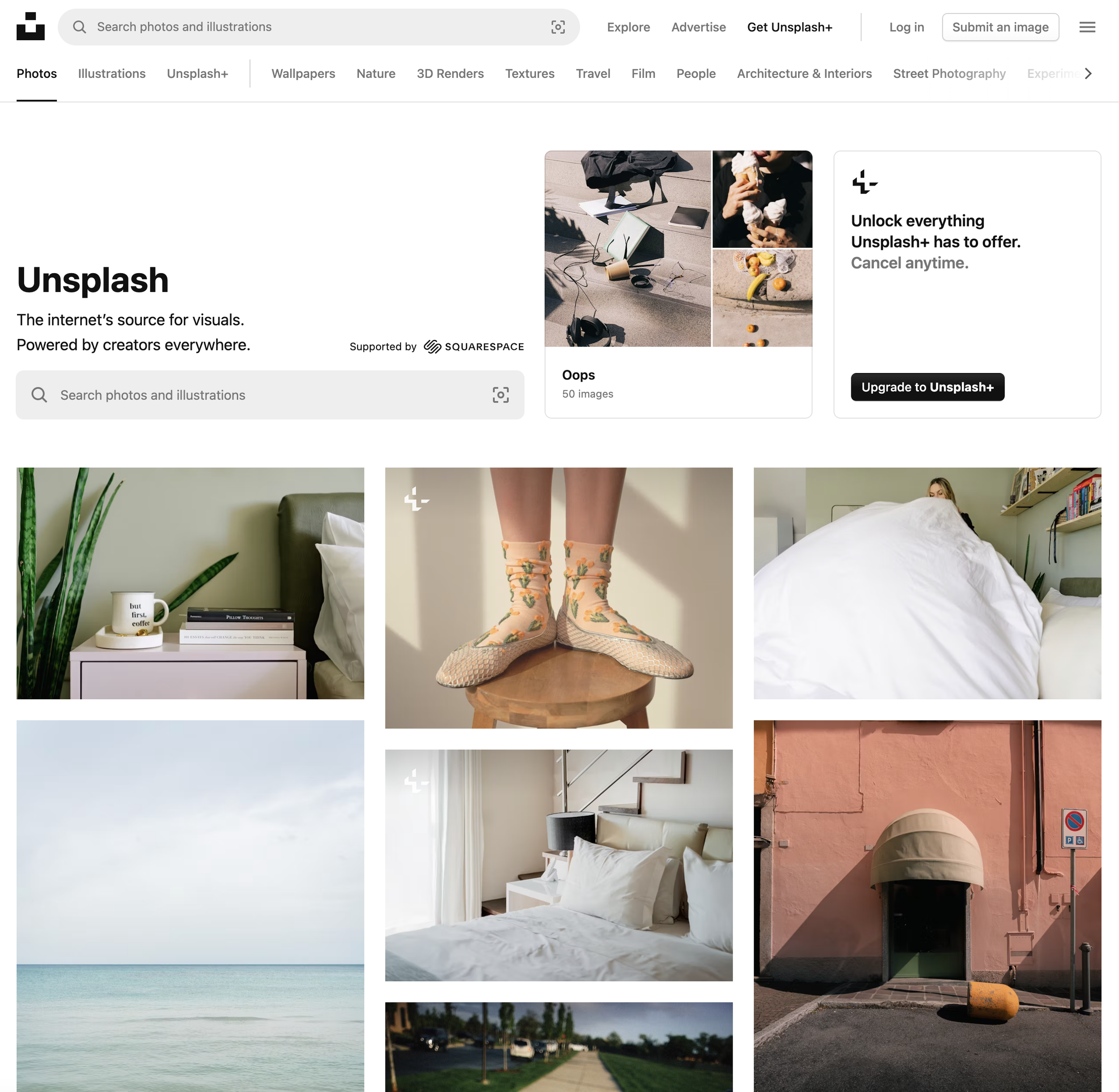
Use high-resolution photos that match what you are discussing. Pexels is a free stock photo resource.
Tell your audience what you think they deserve. Help them see beyond their problem.
Section 3: Guide
When faced with a problem, people naturally want a guide to help them navigate through the problem and ultimately overcome it. Luke Skywalker had Obi-Wan Kenobi. Timo Cruz and the Richmond Oilers had Coach Carter. Moana had Maui. In this section, show your visitors you are the guide for them.
People work with people they know, like, and trust. Introduce yourself in a way that’s true to your personality so they can get to know you and see that you are for them.
In the subheading, communicate empathy and authority, the two things that build trust with clients.
Repeat your specific call-to-action button.
Use an awesome photo that showcases your personality and professionalism. If you cannot afford a professional photoshoot, use your cell phone's portrait setting. Wear clothing that matches your brand colors and minimize background distractions.
Section 4: Testimonials
This is the section where you showcase how you’ve helped real customers find success.
Include at least three quality testimonials to showcase social proof. The best testimonials invite the reader into a real-life story where your customer shares about three things: 1) The specific struggle they were experiencing before they bought from you, 2) How you and your products or services helped them overcome this struggle, and 3) What their life is like now that their struggle is dealt with. Ask your customers to write testimonials using this format, and it will show potential customers that you are truly the guide for them.
Section 5: Plan
When it comes to websites, people are not as intuitive as we might think. We need to lay out a specific plan of action so they know exactly what they need to do to start working with you. The human brain remembers things best in threes or fours, so keep your plan to three or four steps. While you know there may be many steps between starting and the end result, your visitor needs to visualize the entire scope in three or four steps.
Communicate that the process from start to finish is simple (Make sure it is indeed simple).
Lay out three or four clear steps. Step 1 should be your main call to action. Step 3 (or 4) is their success.
You already know...another call-to-action form.
Section 6: Stakes
Great stories keep our attention because they continuously remind us about what’s at stake. Real success and real failure hang in the balance of the hero’s journey. Which result will materialize?
The same is true for your website visitors. By this point, you’ve identified what they want, what their struggle is, positioned yourself as a guide, showcased how your products or services solve their struggle, provided them a plan, and called them to action multiple times. Now it’s time to drive home the stakes. Identify the preferred future they want and remind them of the real failure they want to avoid.
Use high-quality photos of people enjoying your product or service.
Be sure to include the positive emotions they will experience with success. Most people make purchases based on emotion and justify them by the tangible value. Connect honestly to both motivations.
Keeping the negative stakes they want to avoid in front of them helps them remember that they want to make a change in their lives, and you provide an opportunity to help make it happen.
One final call to action.
Section 7: Footer
Sometimes called the “junk drawer,” your website footer is still an essential section of your website. While your header navigation menu should be reserved for the links you want visitors to click, your footer is the place to put everything else. If someone can’t find what they are looking for on your website and they are committed to finding it, they will likely check your footer. Typically, your website footer will appear consistent across all your website pages.
Include a dedicated section where they can download your lead magnet.
I like to use a seldom-used and dark color for the footer to anchor the website and signify the end.
Repeat your brand logo and business one-liner.
Include all your public hyperlinks and social media links. It is also recommended to consult with an attorney to discern which legal website policies you may need on your website.*
It is also recommended to include a copyright notice using your business’s legal name.*
*Clear Sight Design LLC is not an attorney and does not provide legal advice.
Final Tips
Make sure your website design looks good on mobile. Go back and make edits where needed.
Double-check all hyperlinks to ensure they are active and point to the right place.
Professionalize your website by securing and posting legal policies if/where needed (i.e., Terms & Conditions, Privacy Policy, and Disclaimer). Clear Sight Design LLC is not an attorney and does not provide legal advice.
Use high contrast colors so text is readable in all places. Consider Accessibility Settings.
Use adequate “white space” around website sections and elements to allow the eyes to breathe.
Consider Search Engine Optimization (SEO) settings and Google profile setups (see Section 4 below).
Update your website regularly and have fun!

4. Local Search Engine Optimization (SEO) Support
Getting found through local Google searches will help grow your farm business. Local SEO makes this happen. Here are two recommended SEO partners. If you connect with them, please tell them StoryBrand Guide Andy Rhodenbaugh recommended them. Included are helpful Google links.

5. Royalty-Free Stock Photos
Access a folder of curated royalty-free stock photos and browse these recommended sites to find more photos for your website and marketing.

6. Business Growth Courses & Resources
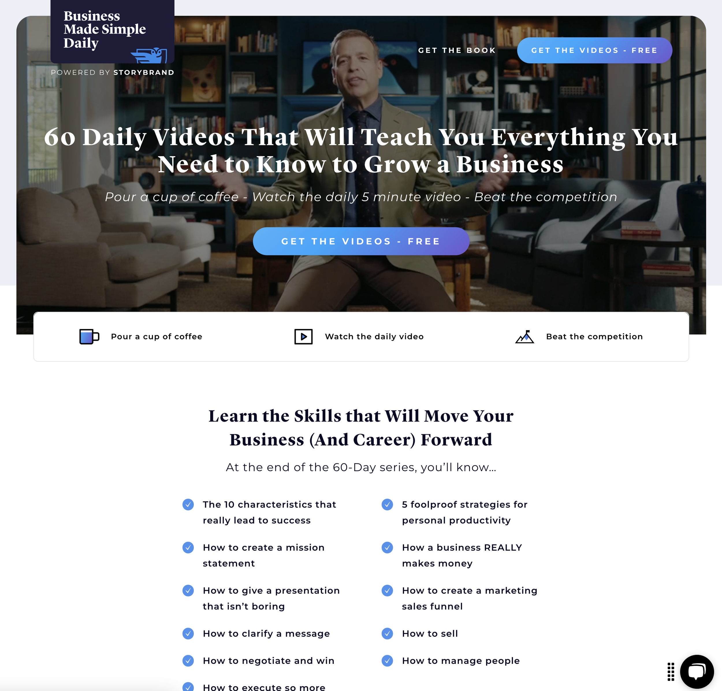
Powered by StoryBrand, these free courses and resources may help your farming business. The links below are affiliate links of Andy Rhodenbaugh, your template designer. Andy is a StoryBrand Certified Marketing Guide. The links are for free services, with paid options for further services also included. Andy receives a commission for any purchases made via these links.

7. Don’t want to DIY your website? Hire Andy to do it…
Andy Rhodenbaugh, owner of Clear Sight Design, partnered with Charlotte Smith to design your website template (You are on his website right now!). Even with your template providing a head start, if a DIY isn’t your thing, you may not want to customize the template on your own. Andy can help you write and customize your website with just a few hours of your time. Request an appointment with Andy using the yellow link below.
Hi, I’m Andy. If DIY isn’t your thing…I got you.
With over a decade of experience building websites, it’s always bothered me when I see entrepreneurs with websites that aren’t honest. Here’s what I mean: The low quality of their outdated website doesn’t tell the truth about the high quality of their products or services. I started Clear Sight Design to change this.
As a StoryBrand Certified Guide, I am trained and licensed to implement the proven StoryBrand Framework.
Here’s what this means for you…
Clear: I’ll clarify your brand message so there’s no confusion about what you offer, the problems you solve, and the value you deliver.
Credible: I’ll customize your template so you look and sound as good as you are.
Compelling: I won’t make up strategy as I go. The StoryBrand Framework has helped thousands, and I’ll employ it to help you grow your revenue and impact.
Nail First Impressions
First impressions matter…a lot. Get a beautiful design that tells your audience you mean business.
Speak Their Language
Get your brand message right so your ideal audience knows you can solve their problems.
Grow Your Business
Websites shouldn’t take weeks to launch. Get your project live in three days so you can focus on growing.
Entrepreneurs like you are getting real results.
Getting started is simple.
1
Request Your Appointment
Be sure to mention you’re a coaching client of Charlotte Smith.
2
Get Your Upgrade
Together we’ll craft a clear message and stunning web design so you can…
3
Grow Your Business
With your website done, you’ll be able to focus on what matters most - serving your people.
You’re a professional. Your website should be too.
Most customers will find you on mobile so we’ll make sure you look and sound phenomenal there too (just like these clients).


